Mistake #2 Brand Fonts
When it comes to your branding, both the colours and the fonts you use must match your brand personality. What does this mean? What does the font you use suggest to people who see it?
Before you choose a font or pair of fonts for your brand, begin by defining your unique and memorable brand personality
Data visualization company Venngage suggest that every brand identity needs a well-defined brand personality. A clear brand personality will be what your customers relate with, connect to and remember you for.
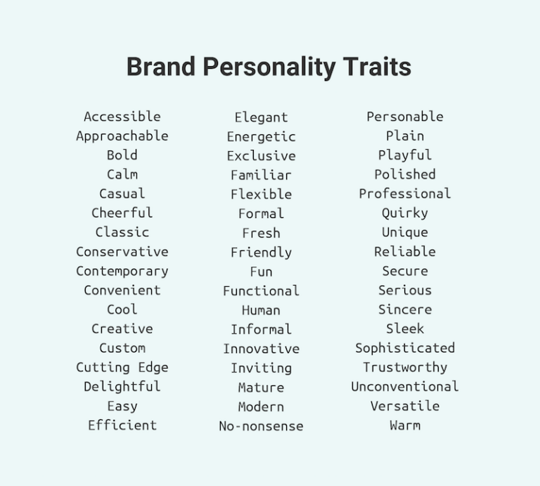
Venngage advise you to work with your stakeholders to pick 3-4 adjectives from the list below:
A legal firm may choose trustworthy and professional. But depending on their clients they may prefer a brand personality that is either formal or friendly, or conservative rather than contemporary.
Be true to yourself. You can’t fake your brand personality. If you are quirky and unconventional by nature you are unlikely to succeed with a serious and sincere brand personality.
Choose a font that shouts out your brand personality
When you have clarified your brand personality you can choose a font that matches.
Did you know fonts have personality too? Here’s how that works.
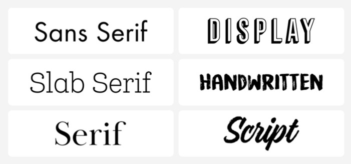
There are 4-6 generally accepted categories of fonts – and they each come with loads of personality. Myfonts suggest 6 categories:
Others may combine Display and Handwritten as Decorative.
As a general rule, serif and sans serif typefaces are used for either body copy or headlines (including titles, logos, etc.), while script and display typefaces are only used for headlines.
As we take a look at each of the categories, it is important to note that each category ahs further sub-categories. It is beyond the scope of this article to go into all the detail.
Serif Fonts
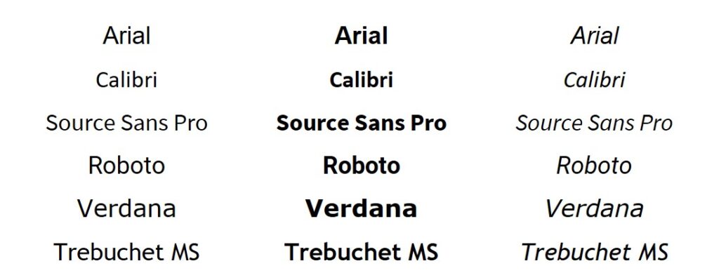
Serif fonts are the oldest, most basic fonts in the book. This classical type of font can be used in a variety of different ways and will likely never go out of style.
This type of font is known by the “feet” seen at the top and bottom of each letter. There are a variety of different types of serif fonts that you can choose from.
Serif fonts are perfect for classic, professional use. They are often used in books, magazines, and newspapers, as serif fonts are considered easier to read in long-form use cases.
In general, there are not many companies that use a Serif font for branding purposes. Many do use Slab Serif though, so we’ll look at that soon.
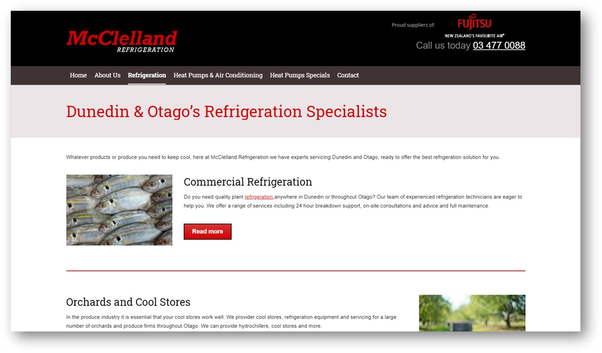
One company using a Serif font is McClelland Refrigeration in Dunedin. Using this font makes them look sincere, reliable and trustworthy.
Mitre 10 Mega use a combination of San Serif and Serif
San Serif Fonts
This classification originates from the French word “sans,” which literally means “without.” Originally designed for display purposes, sans-serif typefaces have been refined to work well as body copy and other layout elements such as captions and annotations.
The absence of narrow and fiddly serifs mean they function better on screens, making them excellent for websites, apps and on-screen identities.
The absence of narrow and fiddly serifs mean they function better on screens, making them excellent for websites, apps and on-screen identities.
Examples of San Serif fonts being used in branding would include Chubb, Urban Homes, and Gold Star Heat Pumps.
Chubb and Goldstar look like long-standing traditional brands, while Urban Homes’ speaks of contemporary, style and quality.
Fox Drainage in Auckland, and Skilled Electrical in Christchurch use a classic bold + light San Serif combination.
Rheem use a stylized San Serif font. In some ways it looks a bit too squished but it is a household name and brand.
Slab Serif Fonts
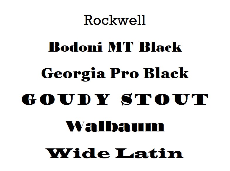
Slab serif fonts are bold, quirky, and confident, and feature larger, blockier serifs. As a result, they look a bit more rugged, bold, and quirky than traditional serif fonts.
Slab serif fonts are typically used where a display font is required, such as book covers, posters, advertisements, logotypes, or as complimentary fonts in a broader type system.
Slab Serif are very popular for branding purposes. Examples include ARC and Cool Air. While Cool Air use a more traditional font to imply reliability and standing the test of time, ARC take a contemporary approach and add some flair with an arc image.
Script Fonts
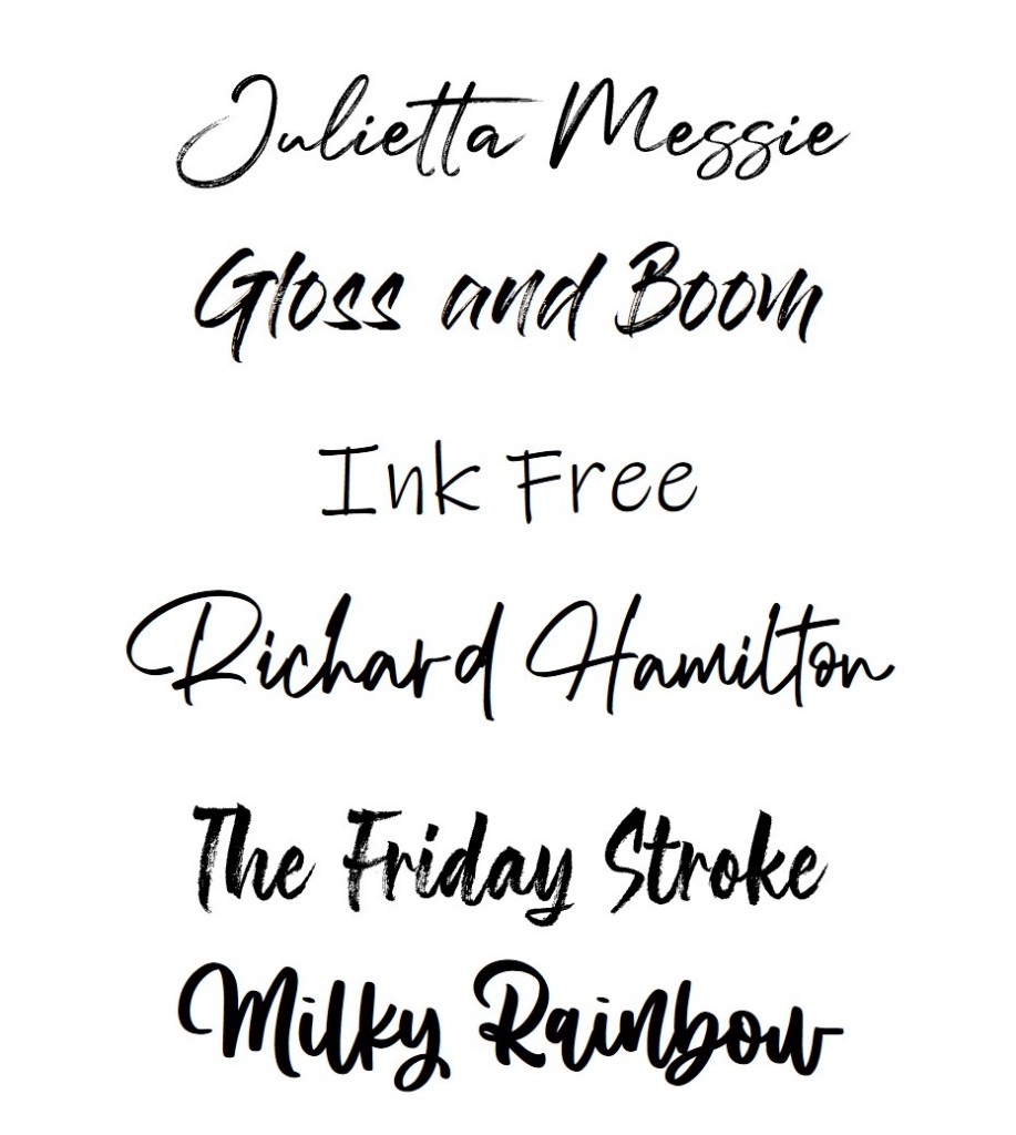
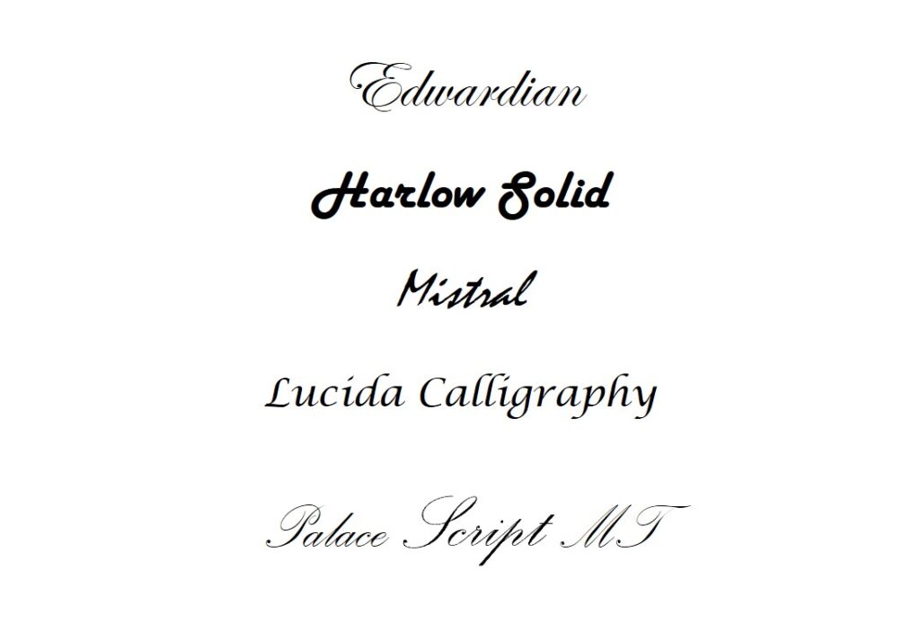
Script fonts are elegant and unique, and are designed to imitate cursive handwriting and some calligraphy. They have character strokes that connect one letter to the next.
Handwritten Fonts
Venngage descibe handwritten fonts as fonts that look like they’ve been written out by hand. They sometimes incorporate weird letterforms, and they’re about as different from traditional serif fonts as you can get.
They’re a fun choice if you want to present yourself as a playful, informal, approachable, or artistic brand.
They work really well for book covers and posters and are inescapable in logo design, as they bring a creative, unique touch that almost all small businesses want to capture.
Display Fonts
A display typeface is one specifically designed for signs, advertising and headlines rather than body text. It can be serif, sans, script, mono or from one of the many specialist subcategories of type.
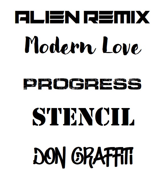
Two great examples of using Display fonts would be Virtual Print who have helped with this series, and North Shore Auckland firm Jenco Electrical.
Virtual Print have used the Display font to suggest friendliness and approachability. VP arent tradies but they have been a great help with this article series!
Jenco haven’t gone the traditional electrician route with their branding. The italicised font together with the colour red suggests energy and forward movement. This is highlighted with the use of lightening.
http://bunnings.co.nz use a combination of display fonts, and are one of the few companies to use a stencil font well.
Ideal Electrical use a modified san serif/display font combined with contrasting colours to great effect
How to create effective font combinations for your brand
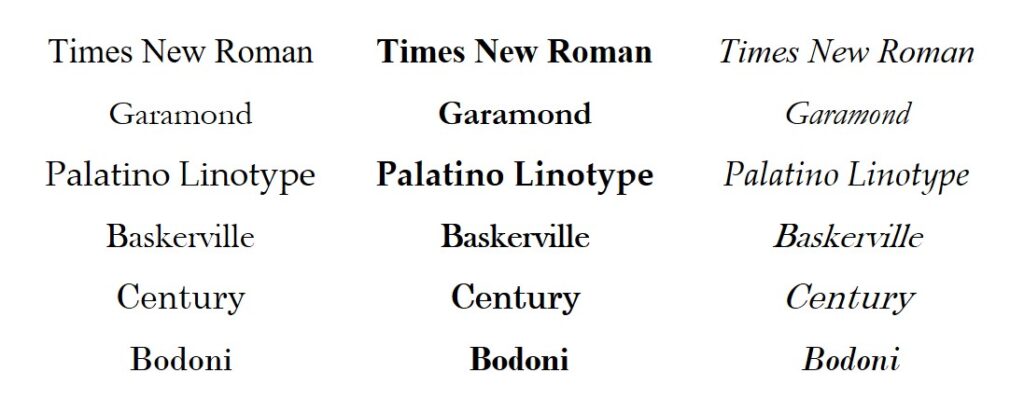
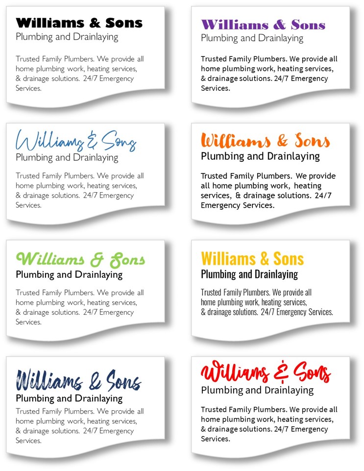
To be effective, your brand should use a combination of two fonts. Sometimes three, but almost certainly no more than that. The key when combining fonts is that they must both contrast and complement each other.
This is often done through a combination of a San Serif heading with Serif text – or vice versa.
You can also use a single font with different weights or styles.
Font Combinations
Application
- Make sure you understand the brand personality you want for your business.
- Make sure you understand the brand personality your customers are looking for. Does your brand give them confidence?
- Ask your customers and stakeholders what the fonts you use suggest to them. Are your fonts reinforcing the brand personality you are wanting to communicate?
- Check to make sure that you do not use too many fonts and lose a sense of cohesion on your branding.
- Are you using the right fonts in the right places? That is, do your heading fonts work as headings? What about in printed material or your web page?
- Are the fonts you are using easily readable?
Get your business noticed by creating an online directory listing. Listings are FREE and you can create as many as you need.
- Get found by locals
